• ×
    Information
    Windows update impacting certain printer icons and names. Microsoft is working on a solution.
    Click here to learn more
    Information
    Need Windows 11 help?
    Check documents on compatibility, FAQs, upgrade information and available fixes.
    Windows 11 Support Center.
  • post a message
  • ×
    Information
    Windows update impacting certain printer icons and names. Microsoft is working on a solution.
    Click here to learn more
    Information
    Need Windows 11 help?
    Check documents on compatibility, FAQs, upgrade information and available fixes.
    Windows 11 Support Center.
  • post a message
Guidelines
The HP Community is where owners of HP products, like you, volunteer to help each other find solutions.
Archived This topic has been archived. Information and links in this thread may no longer be available or relevant. If you have a question create a new topic by clicking here and select the appropriate board.
HP Recommended
Hp prime
Microsoft Windows 10 (32-bit)

Hi,


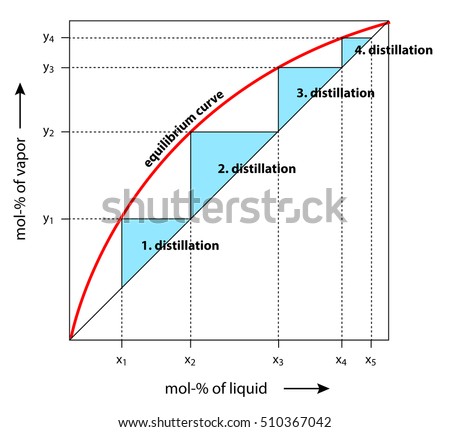
I would like two know how I could generate this graph in the HP prime. Given data points(no functions) for the equilibirum curve (red curve). My problem is I have tried to use the stats2var app but i can only plot 1 curve. how can i plot two and be able to read the axsis so i can determine the points where the red and black curve meet and the number of steps between the curves. it is important that i can read the axsis because in order to find the black curve i must first find the (x,y) where the red and black curve intercept. 


in my problem i am given plenty of data points for the red curve but only (x1,y1) and (y2) for the black curve. so i need the x2 where the curves intercept (top right).


below I have posted a picture of what i am tring to generate on the hp prime. I think the squence app has a similar picture but i am not sure if i can use squence app without having the function.


the easiest thinkg for me to do is to use something like excel scatter plot but i am not sure if hp prime spread sheets is that robust.


See the source image
any help will be apperciated please include pictures or steps i can take to do this. if there is no built in app that can do this can this be programed easily?
3 REPLIES 3
HP Recommended

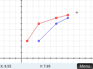
Do I understand you well that when 4 points on the red graph would have coordinates:

(1,3) (3,6) (6,7) (8,7.5)


the coresponding points on the black graph would have coordinates:

(3,3) (6,6) (8,7)  ??


In Statistics 2Var this would look like:


pic2.png


HP Recommended

What option did you select in Stats 2Var to get the lines plotted between the scatter points?

HP Recommended

In Plot Settings (Shift-Plot), second page, I checked the Connect box.


Another thing I did was turning off 'Trace'  in the menu of Plot View, because I wanted to be able to tap any position on the screen and see its coordinates.

In order to actually see them next tap the 'Menu'  button on the screen.

Archived This topic has been archived. Information and links in this thread may no longer be available or relevant. If you have a question create a new topic by clicking here and select the appropriate board.
† The opinions expressed above are the personal opinions of the authors, not of HP. By using this site, you accept the <a href="https://www8.hp.com/us/en/terms-of-use.html" class="udrlinesmall">Terms of Use</a> and <a href="/t5/custom/page/page-id/hp.rulespage" class="udrlinesmall"> Rules of Participation</a>.